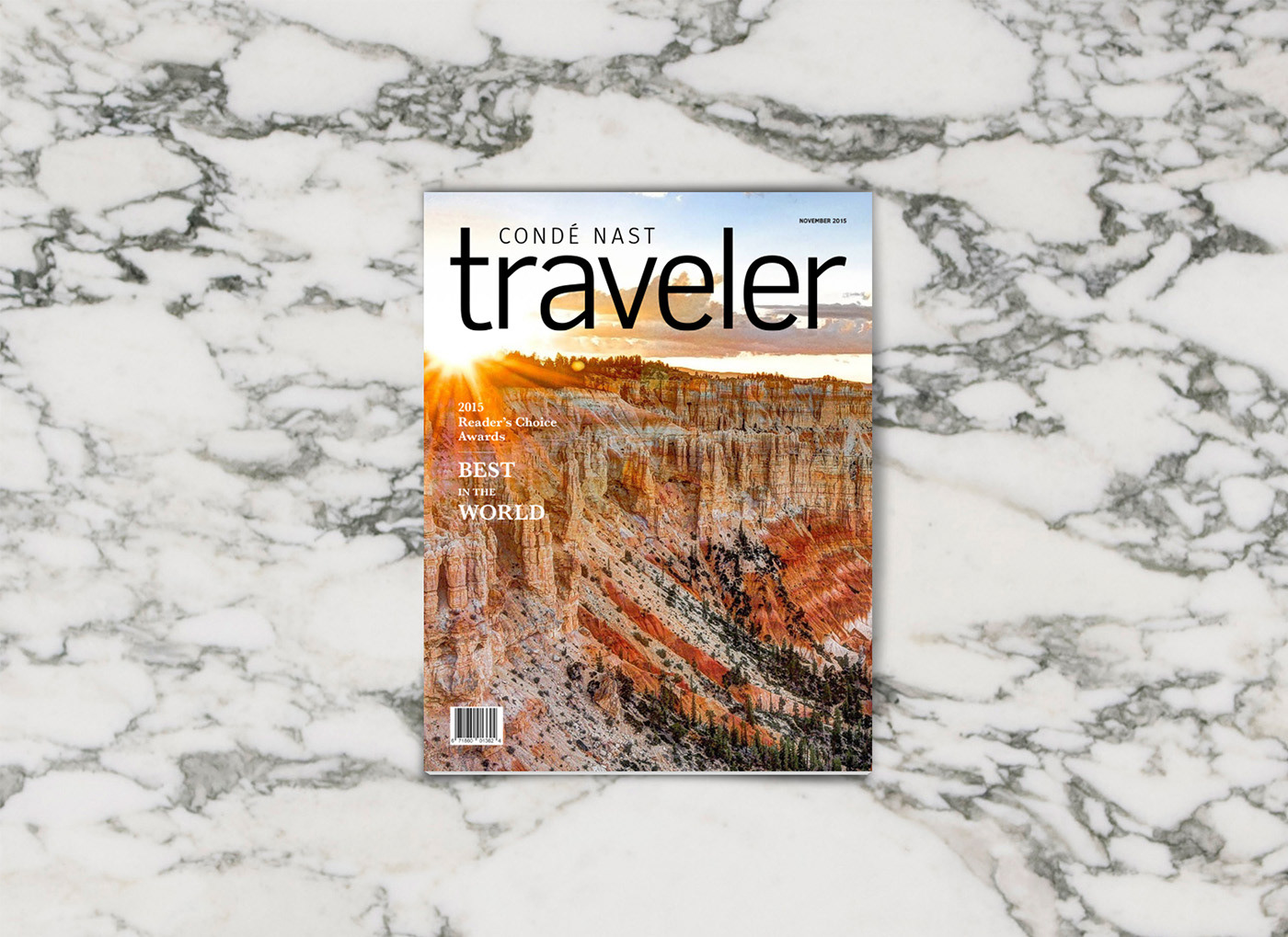
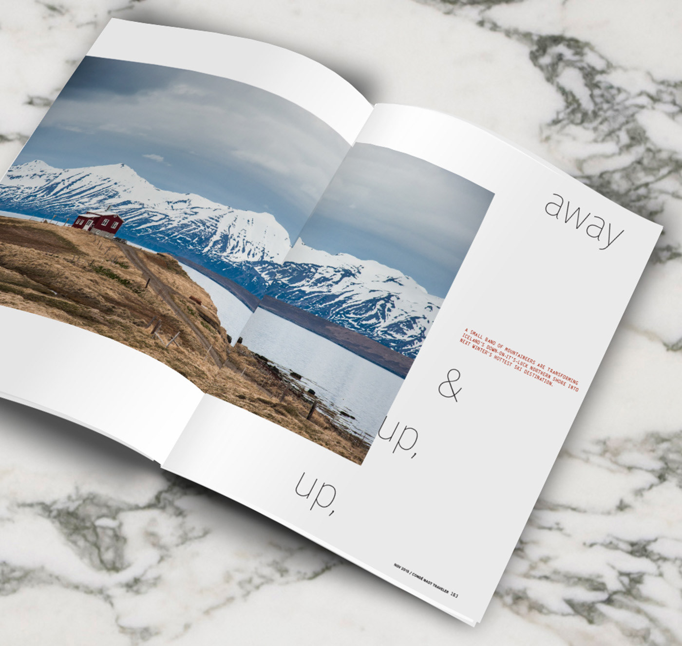
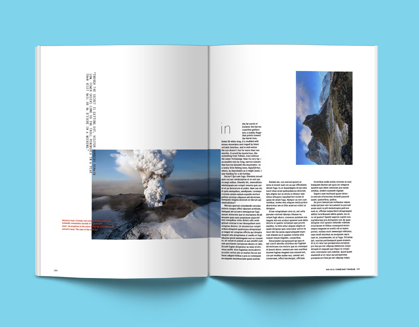
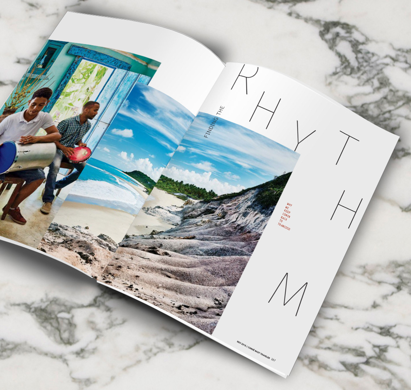
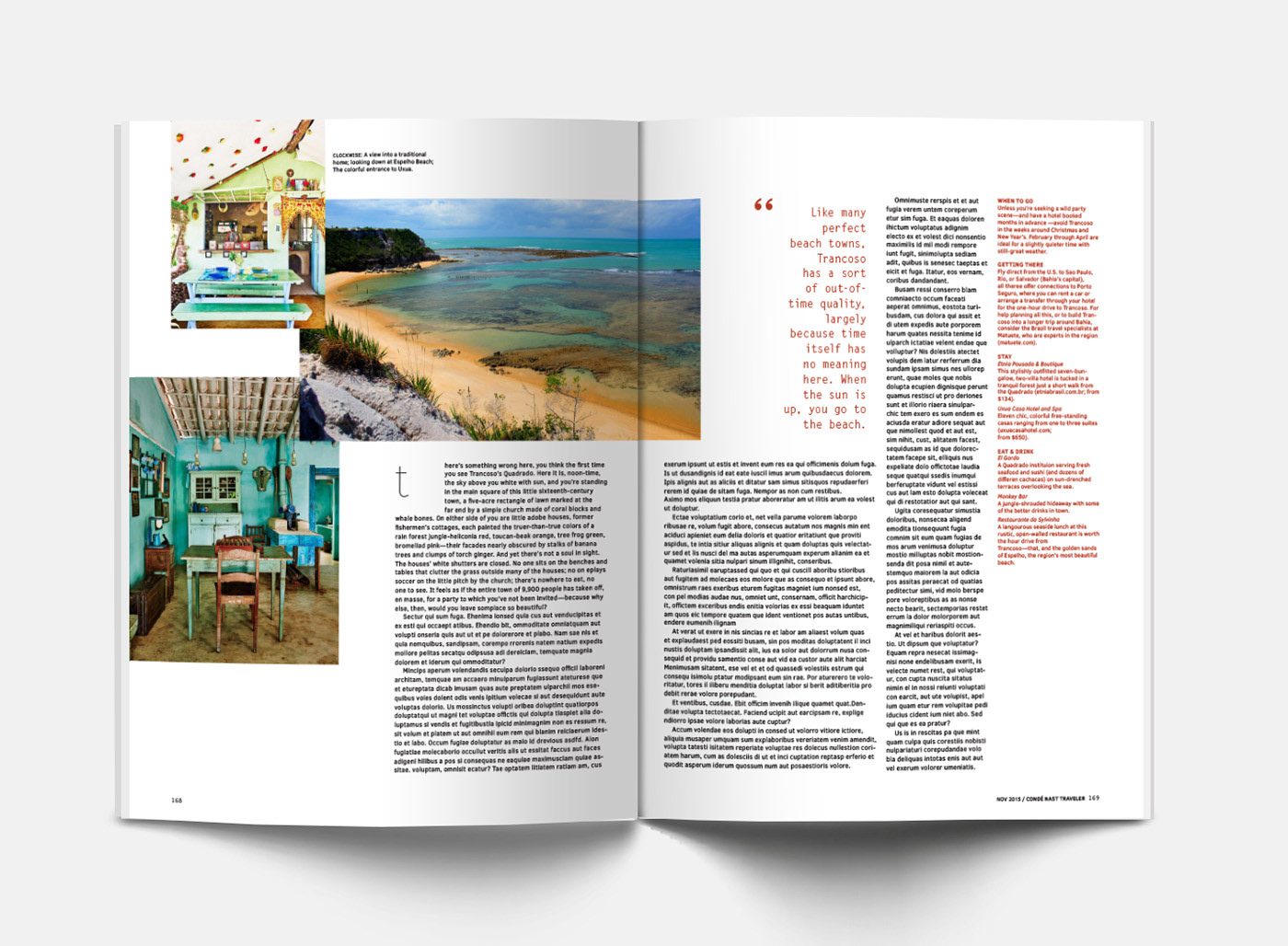

A layout redesign of the magazine Traveler from Conde Nast. I chose to leave more white space throughout the magazine to create an open, airy feel while combining images and text in a way that was effectively eye-catching and interesting, yet still readable and realistic for the brand.